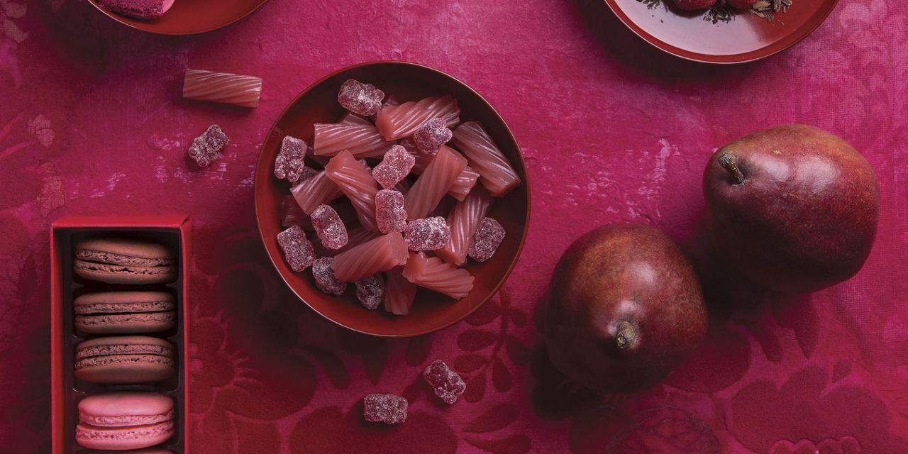
According to Dan Frist, owner, Frontier Label, based in South Carolina, US, rumor has it camel colors and spicy reds are on the horizon, but businesses and consumers can expect to see other colors lining the shelves this year.
“Businesses are already prepping for 2019. In fact, drawing on years of experience and the color palettes recently announced by Pantone, the colors will be tasty, the style will be unexpectedly smart, and the intention will be warm and personal,” he said.
According to Pantone, provider of professional color standards and digital solutions for the design industry, ‘Pantone 16-1546 Living Coral’ is its Color of the Year 2019, an animating and life-affirming shade of orange with a golden undertone.
“In reaction to the onslaught of digital technology and social media increasingly embedding into daily life, we are seeking authentic and immersive experiences that enable connection and intimacy,” said Leatrice Eiseman, executive director, Pantone Color Institute.
“Sociable and spirited, the engaging nature of Pantone 16-1546 Living Coral welcomes and encourages lighthearted activity. Symbolizing our innate need for optimism and joyful pursuits, and embodies our desire for playful expression.”
While ‘Living Coral’ is naturally ideal for packaging applications because it is warm and welcoming, inviting people to reach out and touch the product, Frist tells us what other shades manufacturers can turn to.
Color
‘Bright and bold is here to stay, but how we’ll find them in 2019 will be nothing short of rich extravagance and complete decadence. Two palettes to watch out for this year are colors that indulge our cravings and a return of all things fundamental, such as classico.
When designing, be inspired by the delicious and elegant “neutrals of tasty Butterum and Cappuccino”; “spicy red, sweet flamingo orange and rich purples”; “graceful swan white and camel-colored tan”; “deep teal, chic gray flannel, burgundy red, and caviar black” and “rich gold and apricot brandy”.
A Starburst of a Situation
We’ve got a rainbow road of color to design with this year, but what do we do with it? From this is born the gradient. A little old school for sure, but drenched in colors of a galactic fashion, you will make a statement ready for 2019. From iPhone to Spotify, these trend setters are letting us know not to hold back. With screens now processing brighter/richer colors, vibrancy is in.
Pro Tip
How to catch this color wave: Metallics are trending towards holographic. A change in material for your custom label, could be the key selling point you need to catch the eye of your customer.
Style
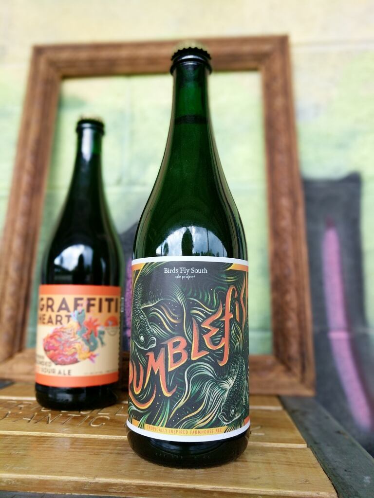
Even with today’s most responsive of websites and attention grabbing graphics, we feel like we’ve seen it all. Tired of predictability, asymmetry in design will be at the forefront of 2019, shaking up the patterns we are used to seeing.
In addition, minimalizm is here to stay, combating our culture of overstimulation.
Wrapped up in minimalizm will be the use of negative space. Negative space creates interest by engaging the mind, and smartly utilizes space that ordinarily might not be used, keeping things clean and simple.
Beyond color choices and style, design is used to connect with the audience, the consumer, the artist. A realness and genuineness will be seen in 2019.
Customization of visuals, whether that be graphics, logos, fonts, packaging, or photos, all will be pushing towards personalization. For example, stock photography of happy people in office buildings or meditative yogis on mountains tops will be replaced with versions that feel more real and accessible.
Graphics and design work might be done by hand or lend itself to that illusion. Fonts will feel more textured and handwritten.
The idea of closeness and connection will be felt through this coming year’s design.'

