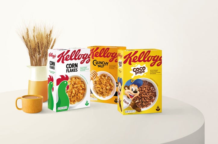
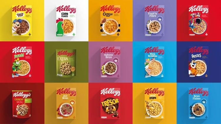
The ‘snap, crackle and pop’ maker said the undertaking was the largest packaging redesign in the company’s 113-year history.
“The Kellogg’s brand is one of the most recognizable brands in the world and our cereal boxes are present in over 90% of UK homes,” said Paul Humphries, VP of marketing at Kellogg’s Europe.
“We know people love, connect and engage with our brand and we wanted to make it easier for them to do that, which is why we’ve updated the entire portfolio at once.”
Straightforward and jargon-free

Kellogg’s commissioned US design agency Landor to undertake the project, with the brief based on feedback that consumers want food packaging to be easier to find, clearer to read and jargon-free.
As such, the new design encompasses bold colors that stand out on shelf, there is less ‘clutter’ on the pack and the language is transparent and ‘straightforward’.
The Kellogg logo has been made larger and appears across the top of each box, while the name of the cereal itself has been made smaller.
The photography is also consistent across the range.
Despite the recent opposition to the use of cartoon characters on cereal boxes, Kellogg’s mascots like Tony the Tiger and Coco the Monkey have been retained, but now appear on the bottom left of every pack.
Another feature is an image of a cereal bowl containing the product positioned as a ‘visual centre point’.
The traffic light labeling system – a voluntary UK system denoting the proportion of fat, sugar, salt and calories – also appears on the new packaging.
Contemporary look
According to Landor, the aim was to return Kellogg’s to its status as the leader of the category with a contemporary and clean look that is instantly recognisable.
Which, according to feedback, it has achieved.
Research by Kellogg found 70% of customers could locate the new packs more easily, while 50% said it increases ‘purchase intent’.
‘The new artwork reflects the naturalness of the food and the heritage of the Kellogg story,' said the cereal giant.
The new cereal packaging is gradually being rolled out across the UK and EU, starting with Kellogg’s Corn Flakes.
Special K and the company’s newer premium offering, W.K. Kellogg, were not included in the redesign.


